
Style is essential to every application. In this article, we'll look at the various techniques for styling our components, including traditional CSS and inline styling. To this point, we have just attached Cascading StyleSheet (CSS) class names to our components. Let's look at a couple of alternative approaches to styling a component. 1. Cascading StyleSheets. 2. Inline styles. 3. Style libraries
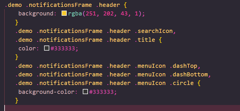
Using CSS to style our web applications is not a new approach. If you've ever developed a web application, you've probably used or written CSS. In short, CSS allows us to apply style to DOM components outside of the HTML itself. CSS with React is not a fresh concept. We'll utilize CSS in React in the same way that we do elsewhere. We'll give IDs/classes to components and utilize CSS selectors to target specific items on the page, leaving style to the browser. As an example, let's style the Header component we've been working with already. Assume we wanted to change the header color to orange using CSS. We can simply solve this by include a stylesheet on our website and specifying the CSS class.header in a CSS class.We may target the header by specifying the styles for the .header class in a typical CSS file. As usual, we must use a tag to add the CSS class in our HTML page. Assuming we define our styles in a file named styles.css in the same directory as the index.html file, and filled in the styles for the Header class names, this would look like the following-

The cascading feature itself is one of the most frequently complained-about aspects of CSS. CSS operates by cascading (as the name implies) parent styles to its children. This is frequently a source of issues since classes have similar names and it is simple to overwrite class styles for generic classes. React offers a not-so-new solution for completely avoiding this issue by allowing us to declare styles inline with our JSX. Adding styles to our actual components allows us to not only specify the styles within our components, but also to dynamically define styles based on the app's state. Defining styles within a component is simple with the style prop. All DOM elements in React accept a style property, which is meant to be an object with camel-cased keys specifying a style name and values that correspond to their value. To apply a color style to an element in JSX, use the following syntax:

Notice how we specified the styles with two brackets around them. The inner brace represents the JavaScript object, whereas the outside brace represents the template tag. In any case, because they are JS-defined styles, we can't use any old CSS style name (the background color would be incorrect in JavaScript). Instead, React demands that we use camel-case for the style name. To update our header component to use these styles instead of relying on a CSS class definition, we may add the className argument with a style prop.
There are also many styling libraries we can use to help us build our styles, such as Radium by Formidable Labs. Most of these libraries are based upon workflows defined by React developers through working with React. Radium allows us to define common styles outside of the React component itself, it auto-vendor prefixes, supports media queries (like :hover and :active ), simplifies inline styling. We are not going to implement this approach in the article. In the next post, we'll talk about adding interaction to components, pure components, and using create-react-app to package our application. The whole code for this post is easily available on my GitHub .
« Read Previous Article in this Series Read Next Article in this Series »